Don’t be afraid of parallel programming in Python

When it comes to writing code, I have always been a believer of the rules of optimization, which state:

The first rule of optimization is: Don’t do it.

The second rule of optimization (for experts only) is: Don’t do it yet.

These rules exist because, in general, if you try to rewrite your code to get a speed up, you will probably waste a lot of time and end up with code that is unreadable, fragile and that only runs a few milliseconds faster. This is especially true in scientific computing, where we are writing in high level languages, which use highly optimized libraries to perform computationally intensive tasks.

However, there are times when those rules of optimization can be broken. And there is a super simple way of leveraging parallel programming in Python that can give you a >10x speed up.

Continue reading
Principal Component Analysis (PCA) For Dummies

PCA is one of the first tools you’ll put in your data science tool box. Typically, you’ve collected so much data, that you don’t even know where to begin, so you perform PCA to reduce the data down to two dimensions, and then you can plot it, and look for structure. There are plenty of other reasons to perform PCA, but that’s a common one.

However, when you ask how PCA works, you either get a simple graphical explanation, or long webpages that boil down to the statement “The PCAs of your data are the eigenvectors of your data’s covariance matrix”. If you understood what that meant, you wouldn’t be looking up how PCA works! I want to try to provide a gateway between the graphical intuition and that statement about covariance and eigenvectors. Hopefully this will give you 1) a deeper understanding of linear algebra, 2) a nice intuition about what the covariance matrix is, and of course, 3) help you understand how PCA works.

Continue reading

How bad is my distribution really?

Most scientists think that t-tests, ANOVAs, linear regression etc rely on your data being normally distributed. Is that really true? And given that no data is perfectly normal, how normal does your data have to be? Can I see what effect non-normality will have on my hypothesis testing? I’m going to use some simply tricks that us to see how bad our distribution is.
Continue reading

Nonnegative Matrix Factorization for Dummies.

It seems like every paper I look at these days has Nonnegative Matrix Factorization (NMF) in its methods somewhere. From machine learning, to calcium imaging, the seemingly magic ability of NMF to pull apart signals gets a lot of use. In this post I want to explain NMF to people who have zero understanding of linear algebra, show a few applications, and maybe give you some inspiration of how to use NMF in your own work.
Continue reading

Merging ROIs in suite2p

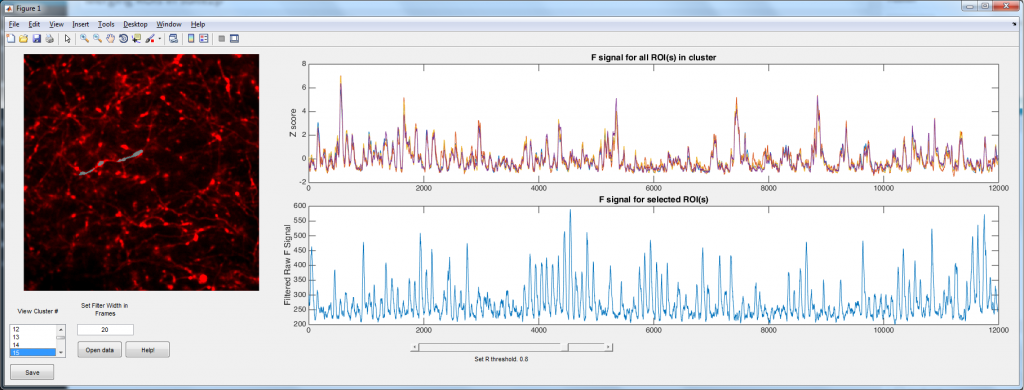
Suite2p is a wonderful Matlab toolbox written by Marius Pachitariu for analyzing population calcium imaging data. It uses a number of computational tricks to automate and accelerate the process (so no more drawing regions of interest (ROIs) by hand!). However, I spend most of my time imaging dendrites and axons, and here suite2p has a problem. Suite2p uses a heuristic that is looking for approximately elliptical ROIs, and hence it tends to split axons/dendrites into a large number smaller ROIs. The problem was simple: how can we merge the ROIs belonging to single cells? Well I used the logic that ROIs that belong to the same neuron should have highly correlated calcium signals (yes, I can imagine a situations where this wont be the case in dendrites, but bAPs will still dominate the calcium trace 99.9% of the time). Hence I simply correlate each ROI with every other ROI. ROIs with a correlation coefficient above some user settable threshold are considered to be part of the same process.

The main script is available here, and it requires distinguishable_colors.m (which in turn requires the image processing toolbox I believe).

join_axon

The code is relatively well documented/commented, and there is even a ‘Help!’ button. If anyone has any problems with it, please let me know.

Filtering by the cell != filtering by the network

Back in 2014 I read this paper, from Judith Hirsch’s lab. To my simple mind, it was a pretty complex model, but it had a cute little video of the thalamus reducing position noise from the retina. I’m not going to lie, I still don’t fully understand the original paper, but probably due to an urge to avoid doing experiments, I felt drawn to make simple integrate and fire model of the retina -> thalamus circuit to see if it filtered noise. The result were somewhat predictable, and I tucked them away. But then an opportunity came to fish them out of the proverbial desk draw, and then I noted something quite interesting: The way the individual cells filtered their input was the opposite of how the network filtered its input. It led me to publish this article. Below you can play with some of the simulations I used to produce the paper*.

Continue reading

Visualizing how FFTs work.

A lot of scientists have performed Fast Fourier Transforms at some point, and those that haven’t, probably are going to in future, or at the very least, have read a paper using it. I’d used them for years before I ever began to think about how they algorithm actually worked. However, if you’ve ever looked it up, unless math is your first language, the explanation probably didn’t help you a lot. Normally you either get an explanation along the lines of “FFTs convert the signal from the time domain to the frequency domain” or you just get this:

X_{(k)}\ = \sum_{n=0}^{N-1} x_{(n)} \cdot e^{-2 \pi i k n / N}

However, the other day I came across an amazing explanation of the algorithm, and I really wanted to share it. While I might not be able to get you to the point that you completely understand the FFT, I think think it might seriously enhance your understanding.
Continue reading

Extracting data from a scatter graph

I’ve already made a rudimentary script for extracting data from published waveforms and other line graphs. But what I’ve needed recently is to be able to extract data from XY scatter graphs. This is a slightly more complex problem because it requires feature detection of an unknown number of points. You can access the script here, and I’ll go over its use and some of the code in the rest of this post. Continue reading

Extracting raw data from figures

Because I’m a cynical bastard, I regularly try to figure out what the real content of a published waveform is. For me, it’s usually someones EEG data that supposedly has some FFT peak that I can’t really believe. So instead of pouring over waveforms with Photoshop (read: Microsoft Paint) to figure out the data that’s in the an image, some time agoe ago I wrote a program in python to allow you to automatically get the numbers.

So I finally translated it to JavaScript, so all of you can benefit from it (and also I can use it at SfN).
Continue reading