Some of you may have seen this graph. It was tweeted out, non-ironically by an economist from a prestigious US university, and at first glace it seems ridiculous:
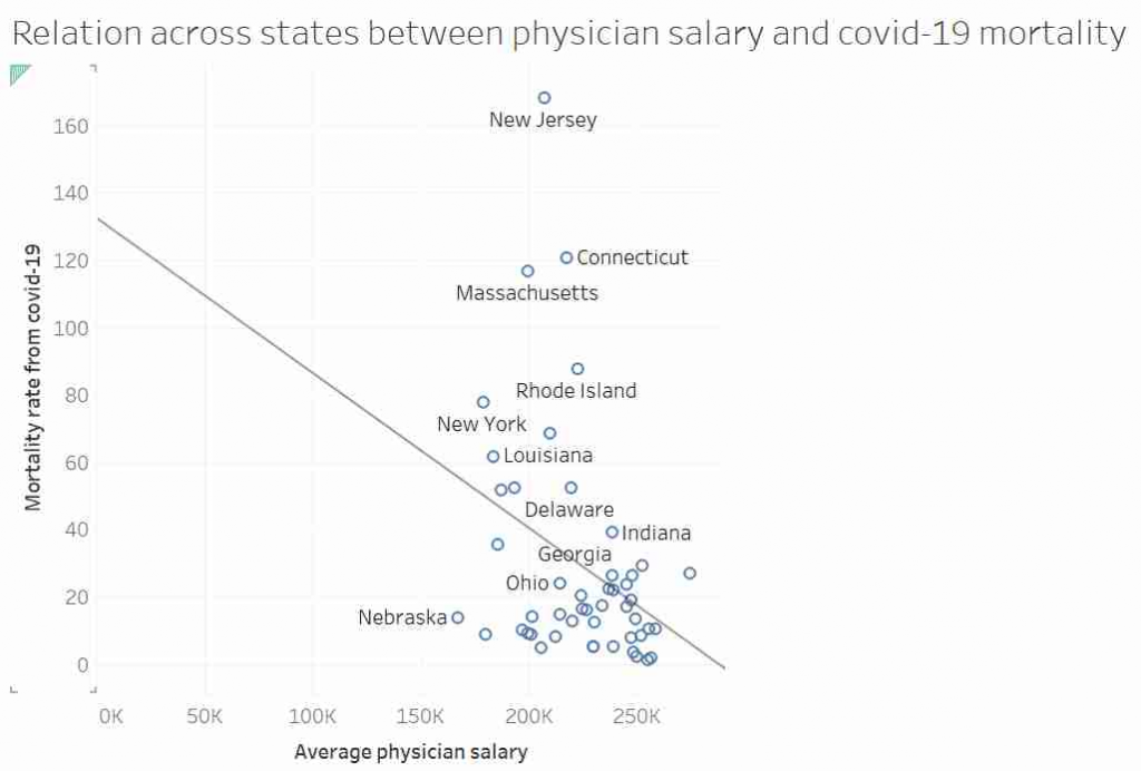
I’d like to talk about this graph, data, regression, causation and data analysis.
Continue reading