PCA is one of the first tools you’ll put in your data science tool box. Typically, you’ve collected so much data, that you don’t even know where to begin, so you perform PCA to reduce the data down to two dimensions, and then you can plot it, and look for structure. There are plenty of other reasons to perform PCA, but that’s a common one.
However, when you ask how PCA works, you either get a simple graphical explanation, or long webpages that boil down to the statement “The PCAs of your data are the eigenvectors of your data’s covariance matrix”. If you understood what that meant, you wouldn’t be looking up how PCA works! I want to try to provide a gateway between the graphical intuition and that statement about covariance and eigenvectors. Hopefully this will give you 1) a deeper understanding of linear algebra, 2) a nice intuition about what the covariance matrix is, and of course, 3) help you understand how PCA works.

The Very Basics
So why do we use PCA and what does it do? (If you’re already familiar with why you’d use a PCA, skip to inside the PCA). Lets say we’re on a project collecting some images of the cells from breast growths, growths which are either benign or cancerous. We’ve just started collecting data, and from each of the images, we’ve calculated a bunch of properties, how big the cells are, how round they are, how bumpy they look, how big their surface area etc etc etc, lets say we measure 30 things. Or put another way, our data has 30 dimensions. We’re worried there is no difference in any of the parameters between the benign and cancerous cells. So we want to have a look. But how do you plot 30 dimensional data? You could compare each dimension 1 by 1, e.g. how smooth are cancerous cells vs the benign cells, how big are the cancerous cells vs the benign cells. And that might be plausible for 30 dimensional data. But what if you data had 1000 dimensions? Or 10,000 dimensions? Here comes PCA to save the day. It will squish those 30 or 10,000 dimensions down to 2, i.e previously, every cell had 30 numbers associated with it: its bigness, its roundness etc. Now it just has 2 numbers associated with it. We can plot those two numbers on a good old fashion scatter plot, and it allows us to see if there is some difference between the malignant and benign cells.
We can find data just like the one I mentioned thanks to the Breast Cancer Wisconsin dataset. We can perform PCA on it and we can plot the result. In this case we see that it looks like there is some difference between the cancerous and benign cells
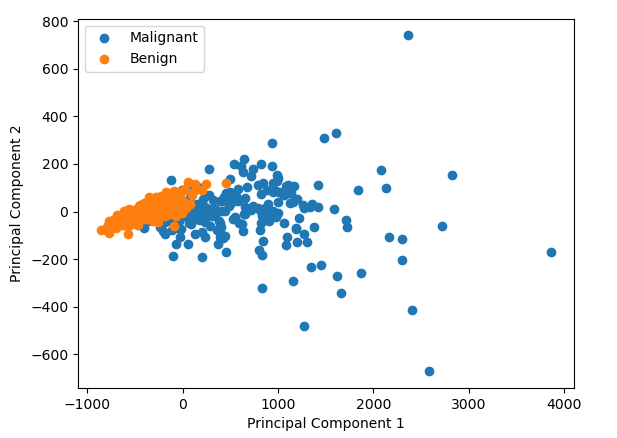
But what did we just do? How do the the two numbers (labelled Principal Component 1 and Principal Component 2 in the graph above) relate to the original data points in the data? It’s very hard to picture what’s going on in 30 dimension data, but if we reduce it down to 2D data, what is doing on becomes pretty intuitive.
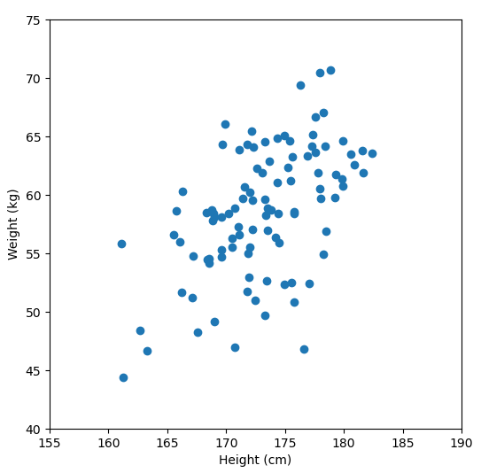
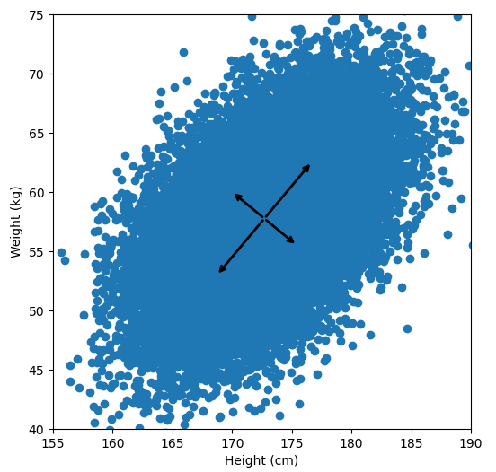
Let’s say we have some data of 50 people’s height and weight.
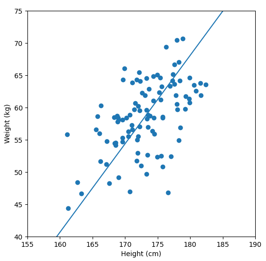
In order to perform a PCA, we first find the axis of greatest variation, which is basically the line of best fit. This line is called the first principal component.
Finally, we “project” our data points onto first principal component. Which means, imagine the line of best fit is a ruler. Each data points new value is how far along the ruler it is.
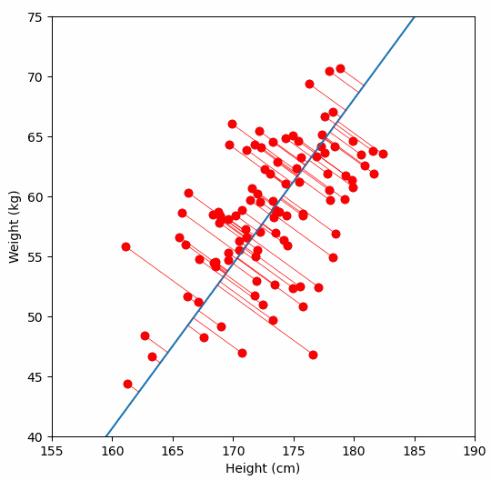
Previously, each individual was represented by their height and weight, i.e. 2 numbers. But now, each individual is represented by just 1 number: how far along the blue line they are. Because our original data has 2 dimensions, there is also a second principal component, which is perpendicular (or “orthogonal”) to the first principal component. In higher dimensions, things get difficult the visualize, but in practice the idea is the same: we get a bunch of principal components, with the first one being the line through our data in the direction of most of the variance, and each subsequent line being orthogonal to the previous, but in the direction of the next most variance. We can then project our data onto as many or as few of the components as we wish.
Inside the PCA
But what does that have to do with this opaque statement that “PCA is the eigenvectors of the covariance matrix”? First we need to understand what a covariance matrix is.
The Covariance Matrix
If you’re familiar with Pearson’s R, i.e. the correlation coefficient, then you basically understand what covariance is. To calculate the covariance between two sets of measurements x and y, you calculate:
If you don’t speak math, this simply says: subtract the mean of x from all of your data points in x, then subtract the mean of y from all the data points in y. Take the resulting two lists of numbers, and multiply each value in x, by its corresponding element in y. Finally, take the average of those products. What this means is that if the covariance is large and positive, then x goes above the mean while y goes above the mean. If the covariance is large and negative, then x goes up while y goes down (or vice versa). If before you calculate the covariance, you z-score/normalize your data (i.e. subtract the mean, and divide by the standard deviation), then when you calculate the covariance, you are calculating Pearson’s R.
The covariance matrix is just an organized way of laying out the covariance between several measurements. For instance, if you had three measurements, A, B and C, then the covariance matrix would be a 3×3 matrix, with the covariance between the measurements laid out like this:
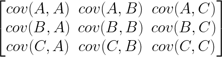
Notice, down the diagonal of the matrix is cov(A,A), cov(B,B) and cov(C,C), the covariance of each measurement with itself. It turns out this is exactly equal to the variance of A, B and C. Again, if you normalized your data before calculating the covariance matrix, then the diagonal of the matrix would be filled with 1s, and all the other elements would be the Pearson’s R of each pair of measurements.
Linear Transformations and Eigenvectors
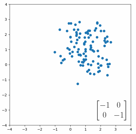
The next thing we need to understand is that basically any matrix can represent a “linear transformation”, which essentially means, a matrix contains a set of rules for moving data points around. A matrix “moves” data points whenever you multiply those data points by the matrix. Below we see a cloud of data points being rotated around the point (0,0) by multiplying the points values by the matrix [-1 0; 0 -1].
The linear transformation that I really want to focus on, is “shearing”. In the figure below, data points are sheared by multiplying them by the matrix [1 0.4; 0.4 1].
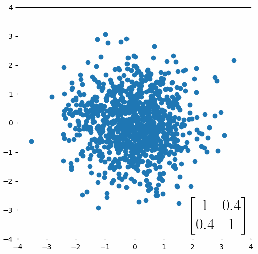
Looking at this animation, I want you to notice something: if a data point had started at the point (1,1) it would have ended up at some other point (z,z), i.e. it would have stayed on the line y = x. This is of course also true for points (2,2), (3,3) or (42,42). All the points that started on the line y = x would have ended up on the line y = x. And so, that line is an eigenvector of our matrix. Perhaps an animation would be helpful:
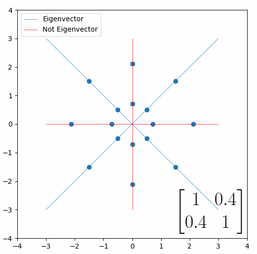
The eigenvalue is how far long this line a data point would move. So, if a point started at (1,1) and ended at point (2,2), then the transformation would have a eigenvalue of 2. If a data point started at (4,4) and ended at (2,2), the transformation would have a eigenvalue of 0.5. So eigenvectors/values are just a simplified way of looking at a matrix/linear transformation, kind of like how we can describe a journey with a step by step itinerary, (the matrix) or by simply the direction we’re heading (the eigenvector) and how far we’re going (the eigenvalue). So, the eigenvectors of a linear transformation are lines that, if a data points starts on it, then after the linear transformation the data point will still be on it. Or even more simply, the eigenvectors of a matrix are the “directions” of the linear transformation/matrix. The linear transformation represented by the matrix [1 0.4; 0.4 1] has two eigenvectors, one on the line y = x, but another on the line y = -x. On the first eigenvector, data points expand away from the center of the graph, so its eigenvalue is 1.4, but on the other line they contract towards the center, so its eigenvalue is 0.6.
Covariance and the Eigenvector
Here comes the magic bit: we can think of the covariance matrix as a linear transformation. Let’s say we had some data that had some correlations within it, and we calculated its covariance matrix, T. If we generated some random normally distributed data, and we multiply it by √T, then it would transform that data so that it had the same standard deviations and correlations we see within our data. So a covariance matrix contains the information to transform random, normally distributed data, into our data. Or put a mathematically:
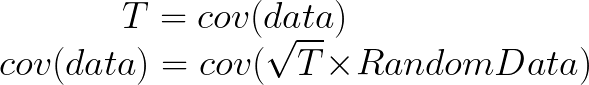
We remember that the eigenvectors of a linear transformation are essentially the directions in which our linear transformation is smearing the data. So the eigenvectors and values of √T will tell us in what directions our data is been smeared in and by how much. Well it turns out that the eigenvectors of T are exactly equal to the eigenvectors of √T, and the eigenvalues of T are just the squares of the eigenvectors of √T. So, we can just calculate the eigenvectors/values of the covariance matrix without having the calculate √T. And this is how we perform PCA. We calculate the covariance matrix of our data, we calculate the eigenvectors of the covariance matrix, and this gives us our principal components. The eigenvector with the largest eigenvalue is the first principal component, and the eigenvector with the smallest eigenvalue is the last principal component.
I know that’s a lot to take in, so lets do some code and make some graphs to see this idea in action.
import numpy as np
import matplotlib.pyplot as plt
import pandas as pd
from sklearn.decomposition import PCA
from scipy.linalg import sqrtm

#Load the data
df=pd.read_csv('http://www.billconnelly.net/data/height_weight.csv', sep=',',header=None)
df = np.array(df)

#Plot the data
fig = plt.figure(figsize=(6,6))
plt.scatter(df[:,0], df[:,1])
ax = plt.gca()

#Perform the PCA
pca = PCA(n_components=2)
pcafit = pca.fit(df)

#Display the components
for comp, ex in zip(pcafit.components_, pcafit.explained_variance_):
	rotation_matrix = np.array([[-1, 0],[0, -1]])
	ax.annotate('', pcafit.mean_ + np.sqrt(ex)*comp, pcafit.mean_, arrowprops={'arrowstyle':'->', 'linewidth':2})
	ax.annotate('', pcafit.mean_ + rotation_matrix@(np.sqrt(ex)*comp), pcafit.mean_, arrowprops={'arrowstyle':'->', 'linewidth':2})

plt.xlabel("Height (cm)")
plt.ylabel("Weight (kg)")
plt.xlim((155,190))
plt.ylim((40,75))
plt.show()
For references sake, the first principal component is (-0.64, -0.77) and the second is (0.77, -0.64). Now let’s calculate them with the way I laid out: by taking the eigenvectors of the covariance matrix:
#Calculate the covariance matrix of the data
T = np.cov(df.T)

#Calculate the eigenvectors and eigenvalues
eigvals, eigvects = np.linalg.eig(T)
for e_val, e_vec in zip(eigvals, eigvects.T):
	print("Eigenvector = {0}, eigenvalue = {1}".format(e_vec, e_val))
Eigenvector = [-0.76873112  0.6395721 ], eigenvalue = 12.620620110675544
Eigenvector = [-0.6395721  -0.76873112], eigenvalue = 38.80431240231845
So the eigenvector with the largest eigenvalue is the first principal component, and it’s calculated as (-0.64, -0.77). Exactly the same as the above version. However, the second principal component is calculated as (-0.77, 0.64), while above it was calculated as (0.77, -0.64). What’s going on? Note, my component points to the top left, while the version above points to the bottom right. But these two components fall on the same line. So while these components are not numerically identical, they are functionally identical. This difference is due to the fact that sklearn uses a computational shortcut to calculate the principal components.
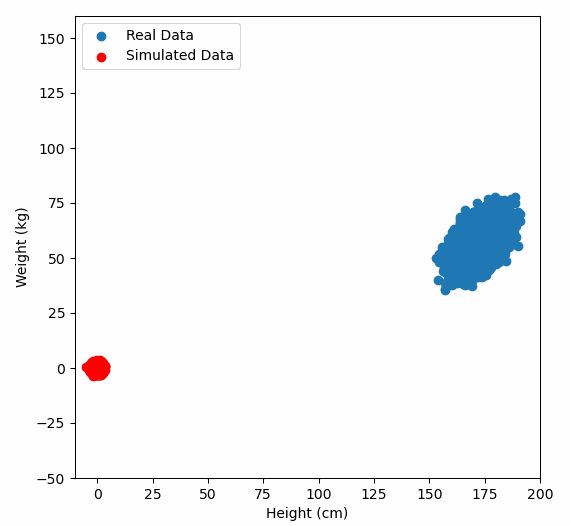
But now lets see the second trick, can we use the covariance matrix to transform random data to look like our original data?
#Calculate the covariance matrix of the data.
#Because numpy.cov works row-wise, we have to
#use the matrix transpose, i.e. the columns
#become rows.
T = np.cov(df.T)
sqrtT = sqrtm(T)

#Generate some normally distributed random data
#and organize it into a matrix.
sample_size = 10000
x = np.random.normal(0, 1, sample_size)
y = np.random.normal(0, 1, sample_size)
A = np.vstack((x,y))

#Perform linear transformation
#The @ symbol does matrix multiplication
Atransformed = sqrtT @ A

#Print results
print("The covariance matrix of the original data is:")
print(T)
print("The covariance matrix of our random data before transformation is:")
print(np.cov(A))
print("The covariance matrix of our random data after transformation is:")
print(np.cov(Atransformed))
Which results in:
The covariance matrix of the original data is:
 [[23.33112407 12.87344728]
  [12.87344728 28.09380845]]
 The covariance matrix of our random data before transformation is:
 [[1.02388073 0.00596005]
  [0.00596005 0.99430078]]
 The covariance matrix of our random data after transformation is:
 [[23.90996341 13.13354086]
  [13.13354086 28.06547344]]
Or graphically, we can show how multiplying random gaussian data points by the square root of some data’s covariance matrix, turns that gaussian data into our data:
So what are the take away points?
- Principal Component Analysis (PCA) finds a way to reduce the dimensions of your data by projecting it onto lines drawn through your data, starting with the line that goes through the data in the direction of the greatest variance. This is calculated by looking at the eigenvectors of the covariance matrix.
- The covariance matrix of your data is just a way of organizing the covariance of every variable in your data, with every other.
- A matrix can represent a linear transformation, which means if you multiply some data points by the matrix, they get moved around the graph.
- The eigenvectors of a linear transformation are the lines where if a data point started on that line, they end on that line, and the eigenvalue says how far they have moved. We can think about eigenvectors being kind of like the direction of a linear transformation.
- A covariance matrix can be used as a linear transformation, and the square root of the covariance matrix of some data will perform a linear transformation that moves gaussian data points into the shape of our data, i.e. they will have the same standard deviations and correlations as our data.
- So, the eigenvectors of the square root of the covariance matrix tells us in what direction our data has been smeared away from perfectly normally distributed and the eigenvalues tell us how far. It turns out, that the eigenvalues of the square roof of the covariance matrix are exactly equal to the eigenvalues of of the covariance matrix, so we just work with the covariance matrix. This direction of the smearing is the same this as the principal components, and how far our data was smeared tells us which direction has the greatest variance. The eigenvector with the largest eigenvalue is the first principal component, the eigenvector with the second largest eigenvalue is the second principal component, etc etc etc…
Hi
Thanks for this post, very interesting and didactic. From my understanding, for a set of data, you can have as many principal components as dimensions, which is not really interesting. What’s interesting is being able to reduce the number of dimensions to 2 or 3. What’s still blurry for me is how do can we manage to link each PC to a % of explained variance and therefore decide whether 1, 2, 3 or N PCs are necessary to describe the data, as it is done in some studies. Does that have to do with the eigenvalue of the covariance matrix?
Thanks
G
Hi Gu, yes, you’re right. So the eigenvalue tells you have far the data has been smeared away from being a perfectly gaussian “sphere”. So the eigenvector with the largest eigenvalue is the first principle component, as it is the direction of the greatest smearing, i.e. the axis of greatest variation. (I added an extra sentence to the concluding bullet points to reinforce this).
Hi Bill, thank you so much for this article. It opened my eyes for intuitive understanding of PCA. I can now imagine how the randomized data points transition alongside the PCs, starting with the one with the longest Eigenvalue, then taking a 90 degree turn to jump onto the next PC and continue for as long as I want to get close to its final destination as per transformation by Covariance matrix – Wonderful!
Hi Bill. At what point does the dimensionality reduction by PCA lose its significance i.e if the eigen values of PC1, PC2 and PC3 are similar, would it still make sense for the dimensions to be reduced to only PC1 and PC2? Is there a metric similar to p value (significance) that validates the PCA performed on a dataset?
Hi Siddhant,
This is a great question, and one I was actually discussing with a colleague just a few days ago.
So first off, if all your eigenvalues are the same, that means your data is a “sphere” and so any linear dimensionality reduction approach wont be able to do anything [You can think of this like how if you hold a ball, no matter which way you rotate it, its shadow looks the same].
Now if the first three are large, and the rest are small, then this is good in a way. You could now make three plots of PC1 vs PC2, PC2 vs PC3 and PC1 vs PC3, and basically reveal the structure of the whole data.
More generally, we are typically interested in how many components we need to explain X% of the variance in the data. This could be 90% or 95%. I.e. the first component might explain 50% of the variance, the next might explain 30% and the third might explain 10%, so all of them together explain 90% so you might think that this is enough. If on the other hand, by the time you sum up the first ten components and you’ve only explained 50% of the variance, then you’re in trouble.
So the explained variance is one of the most important metrics in your PCA. This comes out easily in Python and MATLAB, but R isn’t super helpful. In terms of a P value? This is what I’m unsure of.
Hello, the description was fantastic and really helped me grasp the concepts. I was trying to implement the python code you put together and was getting a strange syntax error with lines 23 and 24 in the “Display the components” section. The error was at the last ‘e’ in ‘arrowstyle’ on line 23
ax.annotate(‘, pcafit.mean_ + np.sqrt(ex)*comp, pcafit.mean_, arrowprops={‘arrowstyle’:’->’, ‘linewidth’:2})
as well as the ‘@’ symbol and the last ‘e’ in ‘arrowstyle’ of line 24
ax.annotate(‘, pcafit.mean_ + rotation_matrix@(np.sqrt(ex)*comp), pcafit.mean_, arrowprops={‘arrowstyle’:’->’, ‘linewidth’:2})
Probably an easy fix, but I have almost no experience with Python.
Thanks!
Joshua
Hi Joshua,
If I copy and paste the code, it works properly. The @ symbol performs matrix multiplication. I’m just using it to show the arrow rotated by 180 degrees.
Feel free to email me with the actual code your using and/or the actual error.
Hi Bill,
Can you help me understand why the eigenvector is multiplied by the square root of the eigenvalue in your plot of the principal components?
It’s my understanding that the eigenvalue represents the amount of variation captured by the eigenvector. How is this idea then connected to the length of the principal component? Thanks
So the covariance matrix of the data shows us how all of the variables covary with each other, and the eigenvectors of the covariance matrix gives us the “direction” of this covariance. So if we imagine and X-Y scatter graph with a cloud of data points, one of our eigenvectors will follow the line of best fit (and the other will be 90 degrees to it). However, does that cloud of data points look like a circle? Or is it highly elongated? Which is basically asking is the covariance of X and Y small or large? The amount of covariance is givne to us in the eigenVALUE of the eigenVECTOR. So I multiple the eigenvector by the eigenvalue to produce a vector whose length is proportional to the covariance. Now, why did I do it by the square root? That was just a mathematical nicety. Covariance is like variance, its units are squared.
Hi Bill,
I appreciate this GREAT post !
It was very helpful for me to recall the basics and principles of PCA.
I’m a Ph.D. student at North Carolina State University studying computer vision-based biomechanics.
I’m currently trying to make a mobile app for our department’s undergraduate students.
This app will be used in a course for teaching them several data science techniques, including PCA.
If you’re fine, could I use the 4th gif image to visually and briefly show how it works in the app ?
I need some fancy figure to attract attention !
I’ll cite both you and this website in the app, if you allow me to do it.
Again, thanks for your great post !
Hi SeeHung, sure, no problem, use away.
Probably the best PCA explanation I’ve read. Mad respect for someone who can take a complex topic and actually explain it, so thanks for that. I’d still love to see some more “real world” examples of PCA being used to further my own education, but this article was an excellent explanation of a complex topic. Often made needlessly more complicated based on poor explanations.
Hi, Can I ask what code you used to created the animated plots? I want to create a figure showing how PCA tries to maximise the SS distances of the projected points to the origin to find the line of best fit. I.e I want the line of best fit to rotate along the origin axis and the perpendicular lines from the original data points to the projected points to shorten/lengthen as it rotates.
Many thanks
Hi Bill!
Great explanations! I was wondering whether the method you have described is single value or eigen decomposition?
Many thanks
Hi Ruth, sorry I didn’t see your comment earlier. I created the animated plots in Python. This tutorial shows how things are done.
https://jakevdp.github.io/blog/2012/08/18/matplotlib-animation-tutorial/
I’m not an expert in linear algebra, but to my understanding, if I say a matrix M and I calculate its eigenvectors v, and I arrange them in columns, to make a matrix V, and I get the matching eigenvalues, and put them in the diagonals of a matrix Λ, then we can say M = VΛV-1 . And this is eigen decomposition. So what I have described in neither singular value, nor eigen decomposition, but it is very related to eigen decomposition (and of course, learning eigen decomposition is a good first start to learning SVD).
Hi, Bill. I am new to this concept but have worked with other more common statistical analyses and especially in application of results to make decisions–i.e., the what next shall a team do based on the stats results. Your explanation of PCA helps me tremendously. Yet, I welcome understanding how to take next steps once the PCA results are in front of me. For instance, do I then go back to my original data set and make what decisions for, for example, do something about the cancer cells in your example; or, what next should I do about improving a process now that I have in hand the PCA results? Big Thanks for any help or examples on that.
Hi Terry,
Interesting question and a hard one to answer without more specifics. In general, PCA is used when you have so much data, you don’t even know what you are looking at. For instance, if I had a dataset of customers, and each customer had 50 features associated with them, their longitude, their latitude, their total purchase history, how frequently they purchase. I might be looking for insight into customer behaviour, but with so many features it is very hard to make sense of the data. We could run the PCA on the data and plot PC1 vs PC2 and see if we see any clusters that would strongly suggest that we might have two groups of customers that we could cater two specifically, when could then look into the loadings of the of PC1 and PC2 to try to figure out which are the important features that separate our clusters.
Honestly I could do a whole post of interpreting PCAs. I’ve got three videos on my youtube channel which might help https://www.youtube.com/watch?v=KuUqOA2LMXc&ab_channel=Bill%27sNeuroscience