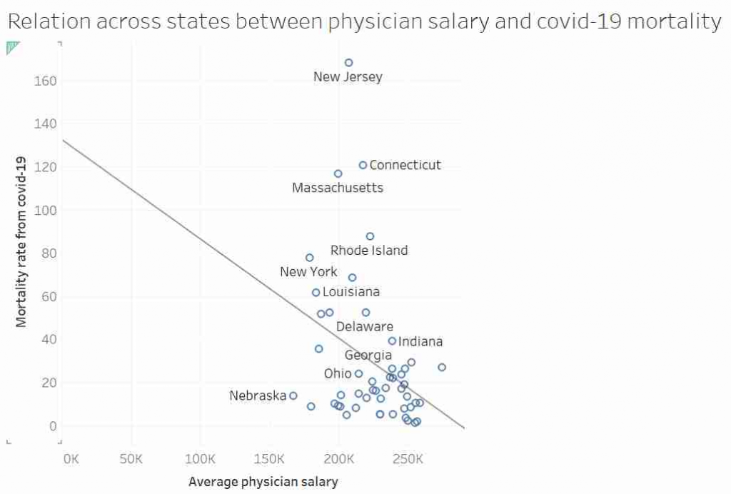
Some of you may have seen this graph. It was tweeted out, non-ironically by an economist from a prestigious US university, and at first glace it seems ridiculous:
I’d like to talk about this graph, data, regression, causation and data analysis.
Before I get started I want to point out that I am not an epidemiologist or an expert in virology or public health. This post is not meant to be guidance on policy. I am using an unusual graph to illustrate problems in data analysis. That said, I also suspect there is a lot of truth in the final conclusion.
Part 1: Things are not always what they seem.
This graph, it was suggested, showed that in US states where doctors are paid more have lower mortality rates from COVID-19. After all look at the trend line!
Most “sensible” people, myself included, saw no relationship between these two measures. And needless to say, the replies to the tweet did not shy away from pointing that out. Thankfully, in a rare moment of wisdom, instead of joining the pile-on, I simply shared the image with my friend and collaborator, Dr Jack Auty. He did the sensible thing and extracted the data using WebPlotDigitizer and run the data through R. I’ve put my data extraction up online, so you can follow along
dat <- read.csv("http://www.billconnelly.net/uploads/covid1.csv")
mdl <- lm(dat$Mortality.Rate ~ dat$Salary)
summary(mdl)

Call:
lm(formula = dat$Mortality.Rate ~ dat$Salary)

Residuals:
    Min      1Q  Median      3Q     Max
-39.860 -17.289  -8.606   7.373 131.549

Coefficients:
            Estimate Std. Error t value Pr(>|t|)
(Intercept) 125.7330    41.7867   3.009   0.0042 **
dat$Salary   -0.4352     0.1854  -2.347   0.0232 *
---
Signif. codes:  0 ‘***’ 0.001 ‘**’ 0.01 ‘*’ 0.05 ‘.’ 0.1 ‘ ’ 1

Residual standard error: 32.81 on 47 degrees of freedom
Multiple R-squared:  0.1049,	Adjusted R-squared:  0.08584
F-statistic: 5.507 on 1 and 47 DF,  p-value: 0.0232
So, I have run a linear regression of salary against mortality, and the summary() function returns all the stuff you typically need to know. And what do we see: well the dat$Salary coefficient is statistically significantly different from zero, meaning the line of best fit is not horizontal. Furthermore it’s negative, meaning that the line of best fit suggests that in states where doctors are paid more, the COVID mortality rate is lower. Finally, the R-squared is around 0.1, meaning that about 10% of the variance in mortality can be explained by the changes in doctors salaries. So does that means the original tweeter was correct?
Well hang on. We’ve run a linear regression, what are the assumptions of linear regression? That is to say, what conditions must we meet in order for the numbers that come out of the linear regression to mean what we think the mean. They are:
- Linearity – In this case, that the relationship between salary and mortality rate is a line.
- Independence – Typically, this is explained by saying that each observation must not be affected by any of the other observations.
- Homoscedasticity – That that variance of Y doesn’t vary as you move along X. For instance, if we wanted to do a regression of height against weight for all the species in the animal kingdom we would be in trouble as the variances of small animals is certainly going to be less than the variance of large animals. Percentage-wise it might be the same, but in units of length, the variance of ants is going to be less than elephants.
- Normality – That the residuals of fit, (that is the distance between the data and the line of best fit) are normally distributed. This is often misinterpreted as that the data itself needs to be normally distributed. But no, it is just the residuals. Though, if this data set was somehow much bigger, and we had thousands of states, if were were able to select a dozen states that almost the same doctor’s salary, we would expect the mortality rate of those dozen states to be normally distributed.
It is the last two assumptions that are often violated, especially when the data goes across more than an order of magnitude. So can we test if this data obeys the assumptions? Yes, we can. We simply say:
plot(mdl)This generates 4 graphs, two of which I want to focus on. The first one shows the residuals against the fitted value
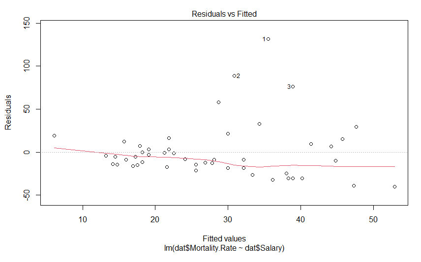
We don’t see anything that terrible, but it’s not perfect either. We would hope to see these data points in nice cloud, where you could draw a horizontal line of best fit. This graph shows us how the data regarding assumptions 1, 3 and 4. If the residuals appear to follow a smooth curve, chances are you’ve broken the assumption of linearity. If the absolute value of the residuals get larger as the fitted values get larger, you’d broken the assumption of homoscedasticity Finally, if the residuals don’t look evenly spread above and below the horizontal line, chances are, you’ve broken the assumption of normality. To my eyes, the data above the line is on average further away from the horizontal line than the data below it, and so I suspect the residuals aren’t normally distributed. Thankfully, the next graph will give us a much clearer answer
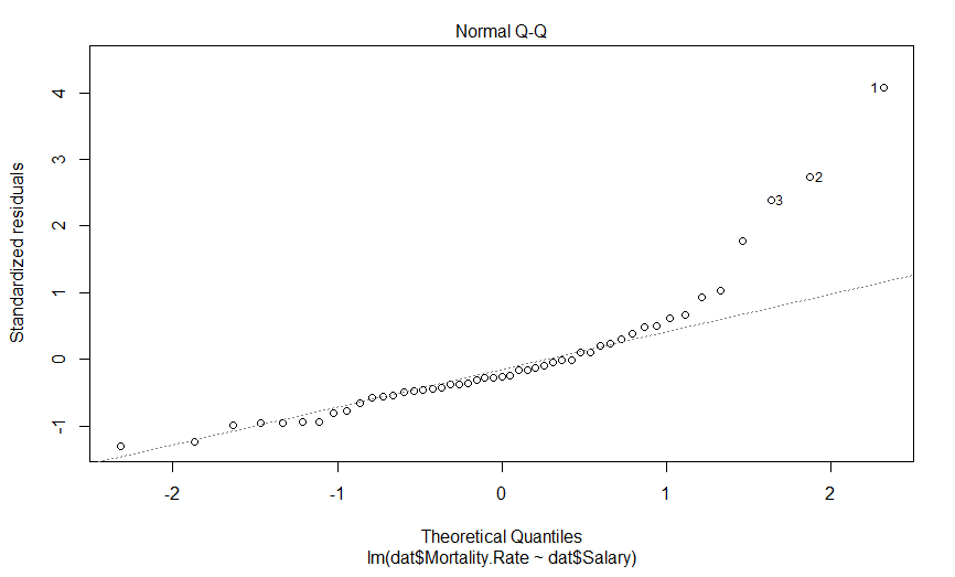
This is a quantile-quantile (Q-Q) plot of our residuals (transformed into a Z-score) against where you would expect them to fall if they were normally distributed. The point here is that if our residuals were normally distributed, they should fall on this dashed line, which they clearly do not, and importantly, they appear to deviate in a predictable fashion.
I suspect that if we log transform our mortality data, our data will be much more nicely behaved. Indeed, log-transforming data typically is necessary when it varies by more than an order of magnitude. So lets do that, and see what our graphs look like
mdl.log <- lm(log(dat$Mortality.Rate) ~ dat$Salary)
plot(mdl.log)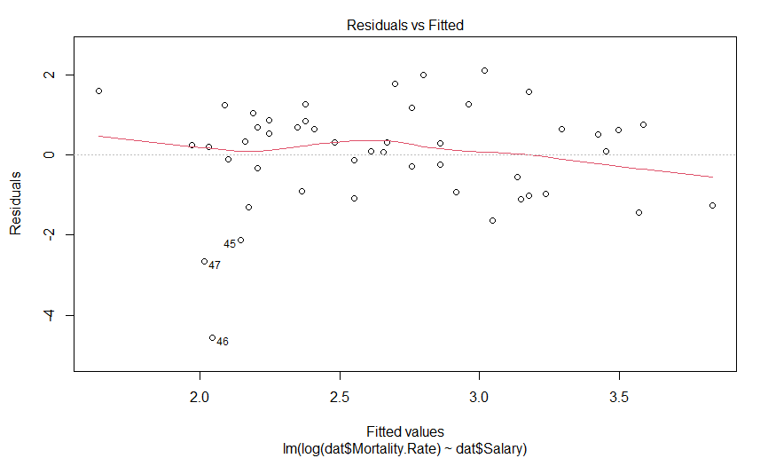
Our plot of residuals against fitted values looks like a bit of an improvement, but it wasn’t that much of an abomination to begin with. But what about the Q-Q plot?
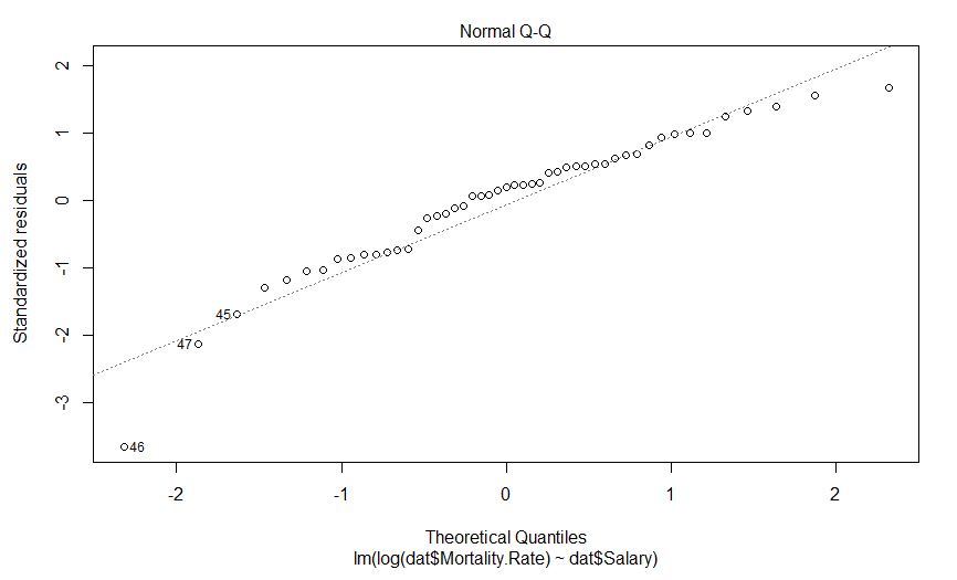
Well this is certainly an improvement. It looks like there is still a predictably deviation from normality, but it isn’t anywhere near as aggressive and it only involves maybe three data points (as opposed to six).
So what does our regression actually say now
summary(mdl.log)

Call:
lm(formula = log(dat$Mortality.Rate) ~ dat$Salary)

Residuals:
    Min      1Q  Median      3Q     Max
-4.5550 -0.9394  0.2459  0.7568  2.1001

Coefficients:
             Estimate Std. Error t value Pr(>|t|)
(Intercept)  7.250797   1.629428   4.450 5.25e-05 ***
dat$Salary  -0.020417   0.007231  -2.824  0.00694 **
---
Signif. codes:  0 ‘***’ 0.001 ‘**’ 0.01 ‘*’ 0.05 ‘.’ 0.1 ‘ ’ 1

Residual standard error: 1.279 on 47 degrees of freedom
Multiple R-squared:  0.145,	Adjusted R-squared:  0.1268
F-statistic: 7.973 on 1 and 47 DF,  p-value: 0.006942
So we have a very significant slope coefficient, which is still negative, and our R-squared value has gone up a bit. And what do our fits look like?
par(mfrow=c(1,2))
plot(dat$Salary, log(dat$Mortality.Rate))
abline(mdl.log)
par(mfrow=c(1,2))
plot(dat$Salary, dat$Mortality.Rate)
abline(mdl)
plot(dat$Salary, log(dat$Mortality.Rate))
abline(mdl.log)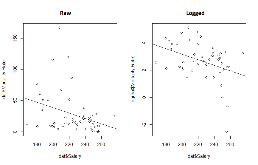
What we really see from this is that if the original twitter post had been displayed with appropriate axis, the whole fit would look a lot more convincing. We also see that transforming the data reduced the P value 10 fold and increased our R-squared. So the take away message here is:
it’s a good idea to make your graphs so they show your point, and but it’s a great idea to think about your data before you subject it to statistical methods.
Part 2: The wise know their limitations; the foolish do not.
Despite the statistical relationship between these two sets of data, what should we take away from this? Does anyone expect that if we started paying doctors more today, that the mortality rate of COVID would drop in the next few weeks? I hope not. Perhaps though, states which pay doctors more have attracted better doctors who have, in turn, improved the health care sector in those states? Or perhaps doctors are paid more in states that value well being more, and those states also contain more people that wear masks? These seems like reasonable hypotheses. Here, the word hypothesis is important. Because the regressions we were performing are hypothesis tests. And every time we perform a hypothesis test, there is a chance that we will incorrectly support our hypothesis, or incorrectly reject it. And this is why we cannot just go around randomly investigating every possible pair of data we can think of, as eventually we will always find two variables that are related, but that doesn’t mean the relationships are causative, or even important, after all correlation does not imply causation. To put it simply, this apparent significant relationship may be nothing more than coincidence.
On the other hand, calling the result a coincidence may be being foolish as well. Another possibility is that states which pay doctor’s more are more wealthy, educated or sparsely populated, and is it those variables that are causative in effecting mortality rates. So the relationship we observed was real, but not causative. That is to say there is a variable that is co-linear with doctor’s salary that we have not observed, and this variable causally relates to mortality rates, otherwise known as the omitted variable bias.
While a full analysis that attempts to control for these various variables may be warranted, the real point I want to get at is that no matter what kind of regression we do, establishing the true cause of why some states show much lower mortality rates will always be difficult without an (quasi) experimental approach. Using an evidence based hypothesis will always boost the validity of a finding, but there is always a chance of the omitted variable bias. Or more simply, when performing regression on retrospective data, no matter how carefully it is performed, or how sensible the hypothesis is, it can never establish causation.
Part 3: Garbage in, Garbage out.
There was something missing from the first post, something I should have noticed the absence of: the data source. Where did the data come from? And what does it mean by mortality rate? Is that per patient with COVID, or across the whole population?
So I went and got the best data I could find, I used the US Bureau of Labor Statistics for the salary information, and the CDC for the mortality rate (total deaths from COVID per 100,000). Because I was convinced this would be important, I got the GDP per capita from the Bureau of Economic Analysis. Finally, I had a strong feeling that wealth inequality would also be important, I included each states Gini coefficient taken from data from the US Census Bureau. Vermont was excluded as the Bureau of Labor Statistics didn’t have their data for physician salary. The data is available here.
I ran a simple model
mdl <- lm(log(mort.rate) ~ salary + gdp + gini, data = cov.dat)
summary(mdl)

Call:
lm(formula = log(mort.rate) ~ salary + gdp + gini, data = cov.dat)

Residuals:
     Min       1Q   Median       3Q      Max
-2.08874 -0.61624  0.01062  0.68168  1.77905

Coefficients:
              Estimate Std. Error t value Pr(>|t|)
(Intercept) -6.262e+00  4.056e+00  -1.544    0.129
salary      -5.532e-06  6.502e-06  -0.851    0.399
gdp          7.384e-06  6.410e-06   1.152    0.255
gini         2.097e+01  7.111e+00   2.949    0.005 **
---
Signif. codes:  0 ‘***’ 0.001 ‘**’ 0.01 ‘*’ 0.05 ‘.’ 0.1 ‘ ’ 1

Residual standard error: 0.9405 on 46 degrees of freedom
Multiple R-squared:  0.3398,	Adjusted R-squared:  0.2968
F-statistic: 7.893 on 3 and 46 DF,  p-value: 0.0002369
We see that salary and GDP have no effect on mortality, but the Gini coefficient does: as the Gini coefficient goes up (wealth gets more unequal) the mortality rate rises. However, while coliniarity between a variable you include and one you exclude can lead to omitted variable bias mentioned above, colinarity is a problem when you include two variables that are colinear too. It leads to poor estimates of coefficients, and in fact, can even make them point in the wrong direction.
In order to test for colinarity, we can import the mctest library and apply all the tests, the most important one being the Farrar – Glauber Test, which tells us some coliniarity exists.
library(mctest)
omcdiag(mdl)

Call:
omcdiag(mod = mdl)


Overall Multicollinearity Diagnostics

                       MC Results detection
Determinant |X'X|:         0.6306         0
Farrar Chi-Square:        21.7442         1
Red Indicator:             0.3721         0
Sum of Lambda Inverse:     4.0983         0
Theil's Method:            0.0965         0
Condition Number:         78.0226         1

1 --> COLLINEARITY is detected by the test
0 --> COLLINEARITY is not detected by the test
And when we investigate who is to blame, if we run linear regressions between the terms, we see that the relationship between doctor’s salary and Gini coefficient is significant.
summary(lm(salary ~ gini, data = cov.dat))

Call:
lm(formula = salary ~ gini, data = cov.dat)

Residuals:
   Min     1Q Median     3Q    Max
-42837 -12142    218  12401  37456

Coefficients:
            Estimate Std. Error t value Pr(>|t|)
(Intercept)   447392      59221   7.555 1.04e-09 ***
gini         -508096     126813  -4.007 0.000213 ***
---
Signif. codes:  0 ‘***’ 0.001 ‘**’ 0.01 ‘*’ 0.05 ‘.’ 0.1 ‘ ’ 1

Residual standard error: 20970 on 48 degrees of freedom
Multiple R-squared:  0.2506,	Adjusted R-squared:  0.235
F-statistic: 16.05 on 1 and 48 DF,  p-value: 0.0002135
Though curiously it appears that states that pay their doctors more have a lower Gini coefficient.
When dealing with colinear data, there are a variety of approaches one can take, but the simplest is simply to simply remove the colinear variable with the least explanatory power, i.e. drop doctors salary. In doing so, we get another model, which suggests a very significant relationship between COVID mortality rates Gini coefficient, again, where states with unequal wealth distribution have high mortality rates. We also see that states with higher GDP per capita have higher mortality rates. Finally, we see an interaction, where states that have a high Gini coefficient and a high GDP. have a reduced morality rate.
> mdl <- lm(formula = log(mort.rate) ~ gdp * gini, data = cov.dat)
> summary(mdl)

Call:
lm(formula = log(mort.rate) ~ gdp * gini, data = cov.dat)

Residuals:
     Min       1Q   Median       3Q      Max
-2.17381 -0.49555  0.06311  0.59163  1.39747

Coefficients:
              Estimate Std. Error t value Pr(>|t|)
(Intercept) -2.831e+01  7.967e+00  -3.554 0.000891 ***
gdp          2.781e-04  1.049e-04   2.652 0.010948 *
gini         6.232e+01  1.590e+01   3.919 0.000293 ***
gdp:gini    -5.212e-04  2.012e-04  -2.591 0.012792 *
---
Signif. codes:  0 ‘***’ 0.001 ‘**’ 0.01 ‘*’ 0.05 ‘.’ 0.1 ‘ ’ 1

Residual standard error: 0.8855 on 46 degrees of freedom
Multiple R-squared:  0.4148,	Adjusted R-squared:  0.3767
F-statistic: 10.87 on 3 and 46 DF,  p-value: 1.618e-05
But again, we should check for coliniarity
> omcdiag(mdl)

Call:
omcdiag(mod = mdl)


Overall Multicollinearity Diagnostics

                       MC Results detection
Determinant |X'X|:         0.0021         1
Farrar Chi-Square:       291.1233         1
Red Indicator:             0.6791         1
Sum of Lambda Inverse:   774.7488         1
Theil's Method:            2.0518         1
Condition Number:        221.7526         1

1 --> COLLINEARITY is detected by the test
0 --> COLLINEARITY is not detected by the test
And every test tells us our data is colinear. Because there are only two variables in our model, we know GDP and Gini coefficients must be coliniar, and a linear regression shows us that as GDP per capita goes up, so does the Gini coefficient.
> summary(lm(gdp ~ gini, data = cov.dat))

Call:
lm(formula = gdp ~ gini, data = cov.dat)

Residuals:
   Min     1Q Median     3Q    Max
-29863 -12025  -1188   8563 110237

Coefficients:
            Estimate Std. Error t value Pr(>|t|)
(Intercept)  -113477      60073  -1.889  0.06494 .
gini          375494     128636   2.919  0.00533 **
---
Signif. codes:  0 ‘***’ 0.001 ‘**’ 0.01 ‘*’ 0.05 ‘.’ 0.1 ‘ ’ 1

Residual standard error: 21270 on 48 degrees of freedom
Multiple R-squared:  0.1508,	Adjusted R-squared:  0.1331
F-statistic: 8.521 on 1 and 48 DF,  p-value: 0.005331
So we are left with only one option, to run two models, one for the effect of the Gini coefficient, and one for the effect of GDP per capita, and we see exactly what the previous models told us, states with a higher GDP per capita or a more wealth inequality have high COVID mortality, but because we ran these models separately, we have no idea about how these variables interact.
> m1 <- lm(log(mort.rate) ~ gini, data = cov.dat)
> summary(m1)

Call:
lm(formula = log(mort.rate) ~ gini, data = cov.dat)

Residuals:
    Min      1Q  Median      3Q     Max
-2.1904 -0.7170 -0.0506  0.7076  1.7694

Coefficients:
            Estimate Std. Error t value Pr(>|t|)
(Intercept)   -9.574      2.652  -3.610  0.00073 ***
gini          26.551      5.680   4.675 2.42e-05 ***
---
Signif. codes:  0 ‘***’ 0.001 ‘**’ 0.01 ‘*’ 0.05 ‘.’ 0.1 ‘ ’ 1

Residual standard error: 0.9394 on 48 degrees of freedom
Multiple R-squared:  0.3128,	Adjusted R-squared:  0.2985
F-statistic: 21.85 on 1 and 48 DF,  p-value: 2.418e-05

> m2 <- lm(log(mort.rate) ~ gdp, data = cov.dat)
> summary(m2)

Call:
lm(formula = log(mort.rate) ~ gdp, data = cov.dat)

Residuals:
     Min       1Q   Median       3Q      Max
-2.72733 -0.58109  0.00395  0.72119  2.03738

Coefficients:
             Estimate Std. Error t value Pr(>|t|)
(Intercept) 1.793e+00  4.383e-01   4.090 0.000164 ***
gdp         1.649e-05  6.673e-06   2.471 0.017070 *
---
Signif. codes:  0 ‘***’ 0.001 ‘**’ 0.01 ‘*’ 0.05 ‘.’ 0.1 ‘ ’ 1

Residual standard error: 1.067 on 48 degrees of freedom
Multiple R-squared:  0.1129,	Adjusted R-squared:  0.09438
F-statistic: 6.106 on 1 and 48 DF,  p-value: 0.01707
And what does out fits look like?
> plot(log(mort.rate) ~ gdp, data = cov.dat)
> abline(m2)
> plot(log(mort.rate) ~ gini, data = cov.dat)
> abline(m1)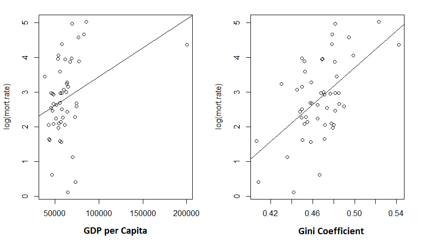
Given the low R-squared for the GDP fit, I’m not particularly shocked to see the unconvincing fit. But the Gini coefficient explained about 30% of the variance in mortality rates.
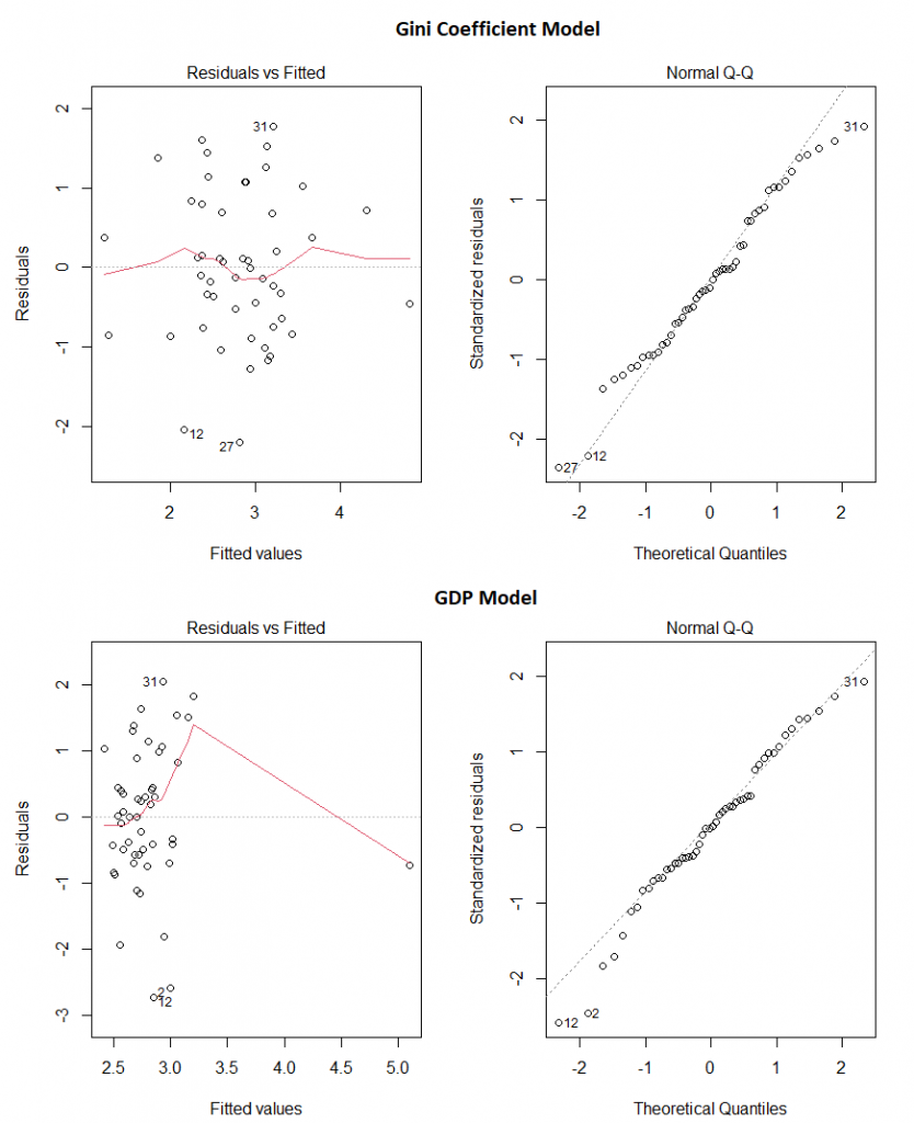
And do these two models appear to obey the assumptions of linear regression? Pretty much:
Our final take away message? Make sure the data you’re using comes from somewhere you trust, use your brain before you even start creating models, and then check the models assumptions before making any claims.
Overall…
So the original graph was a bad graph: it failed to tell the story it was intended to tell, simply due to the choice of range on the X axis. The analysis performed on it was bad because it failed to take into account even the simplest of covariates. Investigating the covariates opened a can of worms, and left me with data the strongly implicated wealth inequality in explaining why some states have much higher rates of mortality due to COVID than others. Though, of course, this analysis in no way can prove causation. As before, it could be some other causative variable that correlates with the Gini coefficient that is leading us to this conclusion.